Xcom
Moderator

Join Date: Nov 1999
Location: Lost in Space
Posts: 3,669 |

Hehe.. Very interesting
entries, guys.
<DISCLAIMER>
All of the below is solely my subjective opinion and is not meant to offend
anyone.
Just pointless ramblings. 
</DISCLAIMER>
The key to good logo
is simplicity. The more complicated design is, the more difficult it is
to adapt to new purposes and media. In order to help me decide which entry
to vote for, I performed two little tests (in addition to just look &
feel).
Test 1 - scale down
to about 1/3 of the original size.
Test 2 - convert to 2 colors (black and white) with no dithering (see
here)
Another important
aspect of a good logo is that it keeps its design intact when converted
to b&w. When a logo is printed on a paper in color, and say.. that
paper gets faxed, it will lose color, but it would still be desireable
for a company to keep its logo recognizable.
Now for the entries:
Dhama,
I can see you in it (at least from where *I* am standing). That is, I
think you managed to make the best "translation" from personality.
But I get the imperession that the image is too complex, which results
in sacrificing of its symbolic meaning. There are some (IMO) unnecessary
graphical effects there(like soft glows, shadows, transparencies). And,
unfortunately, when my b&w test removed them, your design suffered
greatly. To sum up, nice composition for a signature (for example), but
a little bit complicated for a logo.
Staticon,
your work was somewhat of a puzzle for me. To be honest, I didn't like
the color scheme, and again, I don't really see the need for extra decoration
such background noise, bevels, shadows. However... however... my b&w
test gave your logo extra dimension. All that stuff I didn't see fit was
gone, and your logo suddenly appeared to look very cool (like a stamp
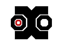
from old Staticon's honorary seal). You get my vote for this. 
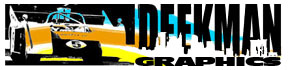
Deekman,
if not for b&w test, you would have gotten my vote. I really like
your style, but I think your logo turned out to be a little bit too packed,
compressed. If you scale it down to say.. business card format, you can
barely see what's in there, especially on the left side. I think if you'd
cut it in half (vertically) and left only the right part intact (with
Deekman text and city silhouette), you would have a killer logo.
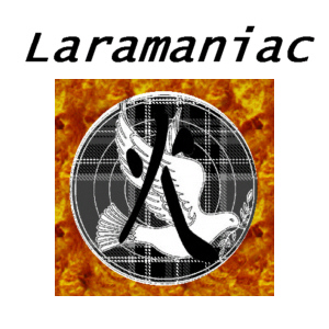
LM,
You need to think more about composition and coloring. The text just hangs
there and doesn't form "whole" with the rest. And there is very
little contrast in the center circle. I noticed only after some time that
there is some symbol drawn over the dove. Usually, people spend only a
few seconds to "process" the logo visually and nobody is going
to "study" it in detail (unlike say photograph or painting).
In other words, if an element is virtually undetectable, there is no point
for it to be there.
lynx,
heheh.. inspired by Soviet Avant-Garde, eh? Groovy. But.. this is not
a logo (all things considered), but more of a poster or a book cover.
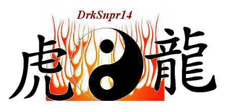
DrkSnpr
Actually, I like your concept. You kept it simple which is good. The color
also seems to be fitting, but the end result somehow lacks certain cohesion..
and symmetry as if you just placed those elements at random (I don't know,
I just get that idea). Ying-Yang generally suggests balance, but the composition
itself is somewhat chaotic. And if you have text in the design, it must
be a part of the composition and not something you just typed above, using
most common font there is. See Deekman's entry where text is nicely integrated
into the design.
Last
edited by Xcom : 04-01-2004 at 06:19 PM.
|