|
Step 6 - Adding the Text
|
|
Now comes an easier section. We will add my screen name
to the sig.
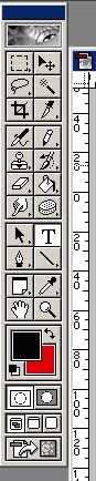
First, select the Text tool from the toolbar as shown, and click the
open book type cursor somewhere in the sig area. Don't worry about positioning
just yet. As we are working with layers, they can be repositioned once
we have the text on screen.
|
|
The status bar at the top of the screen should change
to show the following
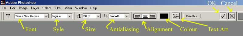
We will be working with the font, size and colour control mainly but
I do like my alignment to be set to center. The style control permits
italic, bold and regular if the font supports it. You may wish to
use this. Antialiasing defaults to smooth and I always use it on this
setting. It gives smoother looking text. Text Art allows you to distort
the text using a number of preset styles. This can be useful but I
do not require it in this sig.
When this status bar appears, there will also be a text cursor flashing
on our work area. This is where I will type my screen name.
|
|
|
|
Initially, the text is quite small but, by highlighting
it (as you would in a text editor or word processor) you can make it
editable. Using the controls in the status bar, I will, firstly, select
a font. In this case, I will use Arial.
Next, I will adjust the size from 20pt to 60pt. Click in the size box
so that you can see a flashing cursor. You can then use the cursor keys
to increment or decrement the size until you are happy with the size.
You may also select a colour for the text at this point but I prefer
to position the text first just to make sure that the size I have selected
is acceptable. You can always reedit the text by selecting the text
tool and highlighting the text as before.
Now click the tick icon to accept the work so far.
|
Use the drop down menu 'Edit' 'Free Transform' as we
did to re-size and position the graphics earlier. (Note: There is
a keyboard shortcut for free transform. CTRL+T)
Move the text to the desired position. In this example, once I had
selected the font and size I required, the text occupied the top right
hand corner of the sig. I have moved it to a more central position
and placed it in the sky area.
|
|

|
|
Now I will pick a colour for the text. Select the text
tool once more, highlight the text and, using the colour selector, choose
your shade. I have gone for a nice bright yellow.
|
|
|
| It is now beginning to look
like a sig.. |