A Rough guide to Sig Creation
|
Step 7 - A Few Final Tweaks
|
|
| There are a few tweaks I wish to add to the sig to enhance
its overall appearance. These are a) a drop effect on the Britannia image,
b) Sepia tone the background image, c) A drop shadow on the screen name
- just to make it stand out a little more and d) Fade my image so that
background can be seen through it - just to make it a little more subtle. |
|
|
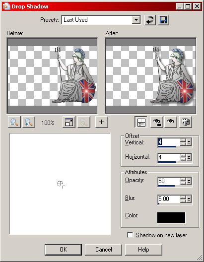
Firstly, let us tackle points a) and c) as they are both drop shadow effects. Firstly, select the Britannia layer (Raster 4). Select the 'Effects' menu, sub menu '3D Effects' and select 'Drop Shadow...'. The 'Drop Shadow dialogue box appears. As you can see, I have set the vertical and horizontal offsets to 4 each, assigned an opacity of 50 and a blur of 5. The black colour is default and seems perfect for shadow to me. Click OK and the shadow will be applied to Britannia.
|
 |
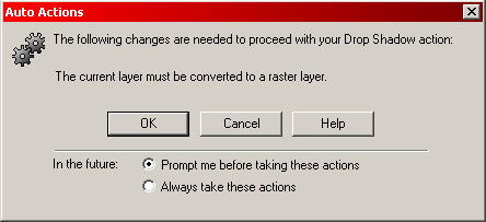 |
Next, select the screen name layer (Vector 1). Exactly the same method is used to drop shadow the screen name except that, when you select the 'Drop Shadow' option, this box (Left) will appear. This is because the text is currently in vector form. Just click OK and let the layer be converted to raster, then proceed with the application of the drop shadow as before. |
|
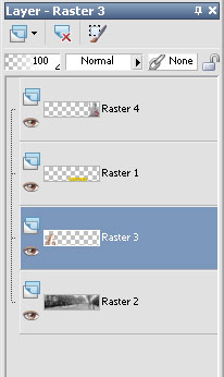
To achieve the faded picture of me, select layer 3 (Raster 3) then either right click the layer box and select 'Properties' from the menu, or simply double click the layer box. |
 |
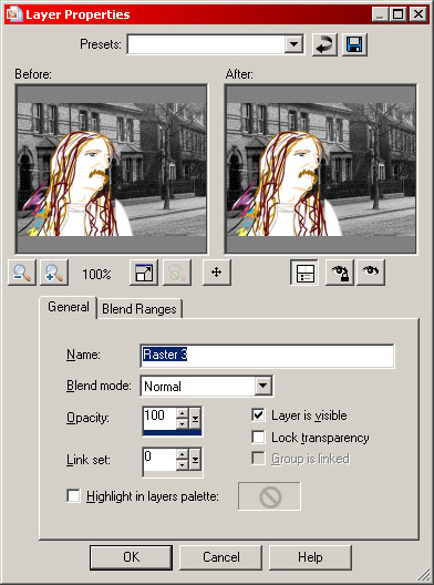 |
Whichever method you choose, you will get the 'Layer Properties' dialogue box as shown on the left. All we need to do here is play with the 'Opacity:' setting. Feel free to experiment with it as much as you like and see what it does. For this sig, I will set it to 55. By the way, if you move the mouse pointer into either of the two graphic windows, you will get a hand type pointer which allows you to move the graphic to the area you want to see. |
|
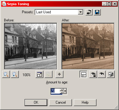
Finally, select the background layer (Raster 2) then the 'Effects' drop down menu, sub menu 'Photo Effects' and select 'Sepia Toning'. This will give you the 'Sepia Toning' box. once again, you can move the graphic in the windows if needed. Have a play with the 'Amount to age:' value until you are happy with the look. I have set it to 70. Click OK to apply. |
 |
|
|
|
|
|
|
|
Now all we have to do is save it and use it. |
|